
Do You Really Need a Mobile-Friendly Site?
Do You Really Need a Mobile-Friendly Site?
How important is it that your site be mobile-friendly? Do you really need a mobile website? Mobile devices have taken over and with Google’s latest algorithm change set to take over on April 21, all signs point to yes. If your site is not mobile-friendly, you will start to see a difference in your site traffic, especially among mobile users. So, what are your options?
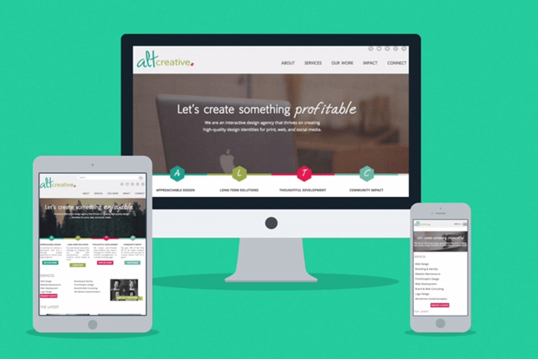
Responsive Design:
Responsive web design (RWD) is an approach to web design aimed at crafting sites to provide an optimal viewing experience across a wide range of devices (from desktop computer monitors to mobile phones).
As you can see in the video above, responsive design is a way of designing your site so that one site provides easy reading and navigation with a minimum of resizing, panning, and scrolling on multiple devices. As the screen size changes, the elements on the page rearrange in order to be optimized for the device.
Separate Mobile Site:
Another way to be mobile friendly, is to create a separate site for mobile users so that when they land on your website, they are redirected to a mobile version, such as http://m.yoursite.com. This strategy can be very useful as it allows for maximum optimization to mobile phones.
Which should I choose?
If your site is running on WordPress, creating a separate mobile site can be as easy as adding a mobile plugin. It’s not a very “pretty” solution, but it can help solve the problem – at least in the short term. If you’re site is not on WordPress, a separate mobile site will need to be created from scratch, which can take significant time and cost. There are several disadvantages to having a separate mobile site such as:
- Content must be maintained on two sites (desktop and mobile).
- Redirects cause difficulty in determining how a user reached your site.
- Tablets are mostly ignored.
As for responsive design, this type of design is implemented into the structure of the site. Therefore, it is best to take a responsive website design approach during every part of the design and development process. If your site is not currently mobile-friendly, it’s very difficult – though, not impossible- to make it responsive. However, it is time intensive and somewhat costly to do so. However, the main advantage of a responsive site is that it will adapt to several screen sizes so you only have to maintain one site.
At Alt Creative, we recommend that if your site is more than 2 years old, then your time and money is best spent on a new website design rather than a retro fit on the current design. Of course, every site is different so please contact us and we can help guide you to the best solution for your site’s longevity and your budget.


Ready to get your project started?
Get your free consultation and pricing quote by filling out our quick ‘request a quote’ form. We’ll answer all of your burning questions and help find the right solution for your project.
Request a Quote